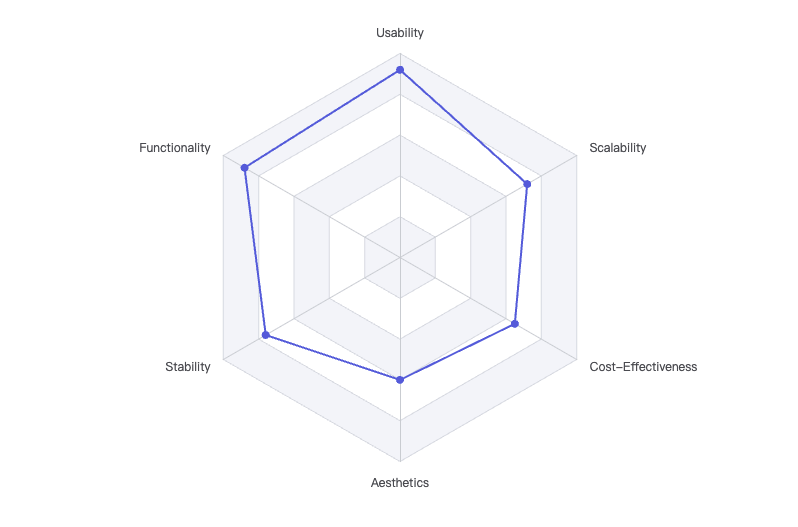
What Is a Radar Chart
The Origin of Radar Charts
Radar charts, also known as spider charts or web charts, have a fascinating history. According to Wikipedia, the radar chart was first introduced by Georg von Mayr in 1877, but it became more popular in the 20th century. The chart was designed to help people compare multiple variables at once, especially when those variables are related to each other. The shape of the chart looks like a spider web, which is why some people call it a spider chart.
The idea behind radar charts is simple: you have several axes coming out from a central point, each representing a different category or variable. The values for each category are plotted along the axes, and then the points are connected to form a polygon. This makes it easy to see how different items compare across many categories at the same time.
What Are Radar Charts Used For?
Radar charts are used in many fields, including sports, business, science, and education. They are especially useful when you want to compare several things across the same set of categories. For example, in sports, coaches might use radar charts to compare the skills of different players. Each axis could represent a skill, like speed, strength, agility, and teamwork. By plotting each player's scores on the chart, you can quickly see who is strong in which areas.
In business, radar charts can help managers compare the performance of different departments or products. For example, you might have axes for sales, customer satisfaction, innovation, and efficiency. By plotting the scores for each department, you can see which ones are doing well and which ones need improvement.
Radar charts are also used in science to compare data from experiments. For example, a scientist might use a radar chart to show how different chemicals react under various conditions. Each axis could represent a different property, like temperature, pH level, or reaction speed.
In education, teachers can use radar charts to help students understand their strengths and weaknesses. For example, a student might have axes for math, science, reading, writing, and art. By plotting their scores, they can see which subjects they excel in and which ones they need to work on.
How to Read a Radar Chart
Reading a radar chart is easy once you understand the basics. Each axis represents a category, and the value for each category is plotted along the axis. The points are then connected to form a shape. The closer a point is to the center, the lower the value; the farther from the center, the higher the value.
If the shape is large and covers most of the chart, it means the item has high values in most categories. If the shape is small or uneven, it means the item has lower values or is strong in some areas but weak in others.
For example, imagine a radar chart comparing three soccer players. Each axis represents a skill: speed, passing, shooting, defense, and teamwork. Player A might have high scores in speed and shooting but lower scores in defense. Player B might be strong in teamwork and passing but not as fast. By looking at the shapes on the chart, you can quickly see the differences between the players.
Advantages of Radar Charts
Radar charts have several advantages that make them popular for data visualization:
- Easy Comparison: You can compare multiple items across several categories at once.
- Visual Patterns: The shapes formed by the data make it easy to spot patterns, strengths, and weaknesses.
- Compact Display: Radar charts can show a lot of information in a small space.
- Highlighting Extremes: It's easy to see which categories have the highest or lowest values.
For example, if you are comparing smartphones, you might have axes for battery life, camera quality, screen size, price, and performance. By plotting the scores for each phone, you can quickly see which one is best for your needs.
Limitations of Radar Charts
While radar charts are useful, they also have some limitations:
- Too Many Categories: If you have too many axes, the chart can become cluttered and hard to read.
- Difficult for Precise Values: It's not always easy to see exact values, especially if the chart is crowded.
- Not Good for All Data: Radar charts work best for data that is related and can be compared across the same categories.
If you have only two or three categories, a bar chart or line chart might be better. If you have more than ten categories, the radar chart can look messy.
When Should You Use a Radar Chart?
Radar charts are best when you want to compare several items across the same set of categories, and you want to see patterns or differences visually. They are great for showing strengths and weaknesses, especially when the categories are related.
Here are some good times to use a radar chart:
- Comparing the skills of athletes or students
- Showing the features of products
- Displaying survey results across multiple questions
- Visualizing performance in different areas
But remember, radar charts are not always the best choice. If your data is very detailed or has many categories, consider using another type of chart.
Real-Life Examples of Radar Charts
Let's look at some real-life examples:
- Sports: Coaches use radar charts to compare players. For example, a basketball coach might plot shooting, defense, passing, and teamwork for each player.
- Business: Managers use radar charts to compare departments. For example, sales, marketing, customer service, and product development.
- Personal Development: People use radar charts to track their own skills. For example, communication, leadership, creativity, and technical skills.
- Education: Teachers use radar charts to help students see their strengths and weaknesses in different subjects.
How to Make a Radar Chart
Making a radar chart is simple. You can use software like Microsoft Excel, Google Sheets, or online tools. Here are the basic steps:
- List your categories (axes).
- Collect the data for each item.
- Plot the values along each axis.
- Connect the points to form a shape.
Many websites and apps can help you create radar charts quickly. Just enter your data, and the chart is generated automatically.
Fun Facts About Radar Charts
- Radar charts are sometimes called "Kiviat diagrams," named after the engineer who popularized them.
- They are used in weather forecasting to show wind speeds and directions.
- Some video games use radar charts to show character stats.